

Ende November konnte ich beim (vorerst?) letzten Vortragsabend der Veranstaltungsreihe „Design for the modern Web“ dabei sein. Die drei Speaker Simon Widjaja, Daniel Connerth (beide EdgeDocks.com) und Andre Jay Meissner (Adobe, klick-ass.com) sind mit dem Programm zuvor bereits in Stuttgart und München aufgetreten, den Abschluss fand die Tour nun in Köln.
 Bis es richtig losging, konnten sich die Teilnehmer im ausliegenden Begleitheft in das Thema des Abends einlesen. Es sollte vor allem um den Einsatz der Edge Tools und Services innerhalb der Creative Cloud von Adobe gehen. Ich hatte mir Edge Animate, Edge Reflow und Edge Code zwar schon angesehen und ein paar Kleinigkeiten ausprobiert. Für einen ernsthaften Einsatz fehlte mir aber bisher der konkrete Anlass und leider die Zeit mich einzuarbeiten. Da ich die Entwicklung in diesem Bereich sehr spannend finde und versuche, auf dem Laufenden zu bleiben, kam „Design for the modern Web“ genau richtig.
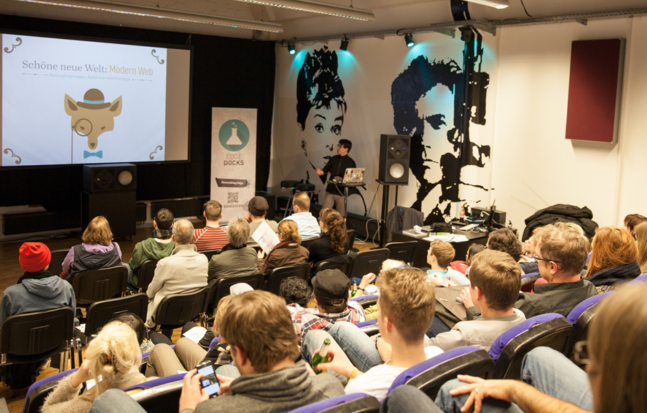
 Gegen 18:30 Uhr gingen die Vorträge los: Simon Widjaja begrüßte die ca. 60 Teilnehmer im Hörsaal der privaten Hochschule „SAE Institute“ in Köln-Mülheim. Die Teilnehmer waren recht bunt gemischt, etwa die Häfte waren wohl Studenten der SAE und anderer Hochschulen, die andere Hälfte waren Berufstätige und Selbstständige. Eine leichte Mehrheit rechnete sich (so wie ich) eher dem klassischen Print-Design zu, einige „reine“ Digitale/Entwickler waren dabei sowie Viele, die sich als „Hybride zwischen der analogen und digitalen Welt“ bezeichnen würden.
Simon Widjaja führte in das Thema der „schöne neue Welt des Webdesign“ ein und überschrieb den weiteren Abend mit sechs Thesen:
 Er rief in Erinnerung, wie völlig anders das Web noch vor einigen Jahren aussah. Unter anderem zeigte er den nebenstehenden Screenshot der Apple-Website von 1997 … schon verrückt, oder? Auf dem Screenshot waren jedoch Bildmarke und der Apple-Schriftzug ausgeblendet bzw. verpixelt; wer Apple als erstes richtig erkannte sollte das Buch „Adobe Photoshop CC – Der Einsteigerkurs“ aus dem dpunkt-Verlag gewinnen. Was soll ich sagen, wegen der der ITC Garamond hab ich auf Apple getippt und so erhielt ich das Buch – vielen Dank dafür nochmal!
Seit 1997 hat sich viel getan: nach der Jahrtausendwende wurde mit schnelleren Datenverbindungen und dem Fortschritt der Technik grafische Gestaltung möglich; es entwickelte sich sich das Web 2.0 mit stilprägenden Verläufen, Schlagschatten und Reflektionen, bis sich in den 2010er Jahren das minimalistische Flat Design zunehmend durchsetzte. Hochauflösende Retina-Displays, Vektorgrafiken, Webfonts mit OpenType-Features bieten mittlerweile viele Möglichkeiten, Websites ähnlich hochwertig zu gestalten wie Print-Medien. Im modernen Web steckt also großes Gestaltungspotential für (Print-)Designer, gleichzeitig stehen wir mit mobilen Endgeräten und der stetigen Weiterentwicklung vor neuen Herausforderungen, so das Résumé.

 Andre Jay Meissner gab in seinem Vortrag ein Update in aktuellen Entwicklungen von HTML5, CCS3, JavaScript, Browserkompatiblität. Außerdem zeigte er, was der Ansatz „Design in the Browser“ konkret bedeutet: Adobe Edge Code bzw. Adobe Brackets nutzt zur Live-Vorschau eine Chromium-Instanz, entspricht also der Ansicht in Google Chrome. So bekommt man einerseits sehr früh ein gutes Gefühl, wie eine Seite im Browser verhält und man kommt als Gestalter gar nicht erst auf abgefahrene Design-Spielereien, die sich nur mit großem Aufwand realisieren lassen. Das der Ansatz aber auch Kreativität einschränkt und nicht für jedes Projekt von Anfang an der richtige Weg sein muss, zeigt die Hot-or-Not-Gegenüberstellung von intuio.
 Spannend fand ich vor allem die neuen CSS-Eigenschaften mit denen individuellere Gestaltung auch im Webdesign möglich wird: Shapes (Textumfluss), Regions (Spalten und verkettete Textrahmen), Blend Modes (Ebenenmischmodus), echte Kreis- und Ellipsenformen statt abgerundeter Rechtecke u.v.m. (siehe webplatform.adobe.com). Er zeigte u.a. die eindrucksvolle Adobe-Demo „Alice in Wonderland“ in der diese Funktionen in Kombination für visuelles Storytelling genutzt werden. Leider funktioniert die Demo mit der aktuellen Chrome-Version nicht mehr, da Google einige noch nicht standardisierte CSS-Eigenschaften wieder deaktiviert hat – mehr dazu im Adobe-Blogpost. Auch wenn die neuen CSS-Eigenschaften noch nicht von allen Browsern unterstützt werden, war es doch ein interessanter Ausblick auf künftige Entwicklungen.
Slides „Zukunft von Design und Layout im Browser“

 Der Vortrag von Daniel Connerth mit dem Titel „Flexible Layouts und Responsive Design“ hat mich am meisten interessiert. Adobe Edge Reflow bietet mit flexiblen Gestaltungsrastern und Breakpoints für unterschiedliche Geräte und Bildschirmauflösungen tolle Möglichkeiten für responsive Webdesign. In diesem Edge-Reflow-Video-Tutorial zeigt Paul Trani, wie intuitiv responsive Layouts in Reflow entstehen. Dabei sollte man nicht nur unterschiedliche Bildschirmgrößen, sondern auch andere Aspekte (z.B. eine schlechte Datenverbindung) berücksichtigen und ggf. kleinere Bilder oder komplett angepasste Inhalte ausliefern, vgl. adaptives Webdesign.
Für ein erfolgreichen Projekt ist es ratsam, neben der Gestaltungsweise auch den eigenen Arbeitsablauf anzupassen. Eine sorgfältige Konzeption, frühe Tests auf Endgeräten und ein agiler Scrum-Workflow vermeiden später Überraschungen mit aufwändigen und teuren Korrekturen. Wie dieser responsive Webdesign-Prozess idealerweise abläuft, ist z.B. im t3n-Artikel „Responsive Webdesign verkaufen“ zusammengefasst, ausführlicher kann man dies im „Responsive-Webdesign-Buch“ von Christoph Zillgens nachlesen.
Wie mir Daniel Connerth später erläuterte, ist der HTML- und CSS-Code von Edge Reflow zwar valide, bedarf aber in der Regel weiterer Optimierung, z.B. wird jedes Element als „ID“ gestylt statt mit „class“ gleiche Eigenschaften zu definieren. Außerdem wäre eine direkte Schnittstelle zu CSS-Präprozessoren LESS/SASS sehr hilfreich. Aber ich bin sicher, dass die Adobe-Entwickler bereits dabei sind diese Schwachstellen zu beheben. Edge Reflow bleibt also zunächst ein (sehr gutes) Tool um responsive Prototypen zu erstellen, statt mehrere statische Photoshop-Layouts für unterschiedliche Bildschirmgrößen zu gestalten und erst danach mit dem Code zu beginnen.
Slides „Flexible Layout und responsive Design“
 Um responsive Websites zu prüfen gibt es neben der Größenänderung des Browserfensters („die Bewegung, die kein normaler Nutzer je gemacht hat“) auch Simulationstools, diese ersetzen aber natürlich nicht den Test auf echten Endgeräten. Um nicht auf mehreren Geräten die Seite ständig neu laden zu müssen, kann man diese mit Adobe Edge Inspect „gleichschalten“ und vom Desktop fernsteuern.
Doch reicht eine handvoll Testgeräte aus? Damit nicht jeder Webentwickler bzw. jede Agentur sich Unmengen an Geräten zur Verfügung halten muss, präsentierte Daniel Connerth die Initiative OpenDeviceLab. Allein in dem OpenDeviceLab am Kölner Hauptbahnhof stehen 277 Geräte (neben Smartphones und Tablets auch Spielekonsolen und Smart-TVs) zum kostenfreien Testen zur Verfügung. Eine tolle Initiative die um responsive Websites gründlich zu testen.
 Zum Abschluss machte Simon Widjaja die „Wundertüte“ Edge Animate auf. Animate erinnert stark an Flash, basiert allerdings auf HTML, CSS, SVG und JavaScript. Bilder, Texte und Vektorformen lassen sich wie in Flash mit Schlüsselbildern auf einer Zeitleiste intuitiv animieren und mit Interaktivität anreichern, den HTML- und CSS-Code schreibt das Programm im Hintergrund.
Für einen guten ersten Überblick über Edge Animate eignet sich z.B. das Video von der CreateNow 2013:
Weitere Video-Tutorials gibt es z.B. auf tv.adobe.com und im EdgeDocks-Youtube-Channel
Das sich mit Animate nicht nur hübsche Werbebanner erstellen lassen, zeigte er in vielen Beispielen, die er teilweise live animierte. Bei den vielen Animations-Möglichkeiten kann man aber auch leicht übers Ziel hinaus schießen: ein übertriebener Einsatz von Bounce- oder Elastic-Effekten wirkt z.B. schnell „so albern wie Comic Sans für Typografen“, so ein augenzwinkernder Vergleich. Stattdessen eignen sich die verschiedenen Ease-In-/Ease-Out-Effekte für dezentes Beschleunigen und Abbremsen von Animationen.
Bei dem Thema und Tempo rauchte offenbar nicht nur mir der Kopf, auch der Beamer rauchte während des Vortrags plötzlich ab. Die Veranstalter ließen sich nicht aus der Ruhe bringen, nach einem spontanen Raumwechsel ging es direkt weiter. Simon Widjaja zog dann noch einige spannende Beispiele aus dem Hut: Dank der JavaScript-Schnittstelle und Erweiterbarkeit lassen sich auch komplexe Interaktivitäten, Parallax-Effekte und sogar kleine Browsergames umsetzen. Einige solcher JS-Erweiterungen und Experimente sammeln Simon Widjaja und Daniel Connerth auf EdgeDocks.com
Slides „Interaktive Webanimationen“
Ein vollgepackter Abend, statt Geschwafel gab es viel praxisnahen Input, präsentiert von kompetenten Referenten – mehr kann man wirklich nicht erwarten, zumal von einem kostenlosen Event. Der Abend hat sicher manche Scheuklappen und Ängste von eher analogen Gestaltern abgebaut und ermutigt – ich hab nach dem Abend jedenfalls Lust bekommen direkt loszulegen. Und selbst wenn ich nur einige Aspekte selbst produktiv nutzen werden, erleichtert es schon die Kommunikation mit den Web-Entwickler-Kollegen. Am Ende fehlte leider die Zeit und Raum für weiteren Austausch mit Referenten und den anderen Teilnehmern, vielleicht lässt sich das ja bei dem Adobe Edge Meet Up nachholen.
Fotos: Daniel Connerth, Apple, Adobe

